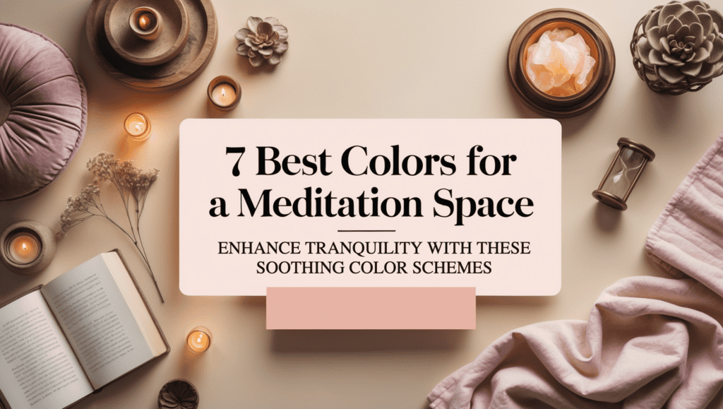
Creating a meditation space that calms the mind and soothes the spirit starts with choosing the right colors. I’ve spent time experimenting with different hues in my own cozy corner, and I discovered that the perfect blend of colors can transform even a small area into a serene retreat. This article offers clear, actionable ideas on seven specific color schemes that work wonders for a meditation space. You’ll gain practical advice, exact color details, and tips for combining these hues with decor elements that boost relaxation.
Every detail matters when designing a space that reflects calm and mindfulness. With each idea, you will learn how specific colors affect emotions and energy, allowing you to create a nurturing environment for quiet reflection. The insights shared here come from hands-on experience and the science of color psychology, making it easy for you to design a space that supports mental clarity. Whether you have a small corner or a larger area, these tips empower you to build a personal haven that promotes balance and inner peace.
Let’s dive into the specifics so you can immediately apply these ideas. The article will guide you through the benefits of color psychology, seven proven color schemes, and practical steps for integrating natural elements, DIY decor, and regular maintenance. Each section is designed to give you a complete picture of how to transform your meditation space into a dynamic, calming retreat that nurtures both mind and soul. Get ready to explore, experiment, and embrace a new approach to personal serenity!
This post may contain some affiliate links. I only recommend products and services I genuinely believe in. Additionally, some content on this website may have been created with the assistance of AI.
What You Might Need
- Calming paint or removable wallpaper in the chosen colors
- Accent decor such as cushions or wall art
- Adjustable lamps or natural light sources
- Indoor plants
- Minimalist furniture or a dedicated meditation mat
- Aromatherapy diffusers or essential oil burners
- Soft textiles like blankets or rugs
Understanding the Psychology Behind Color Choices
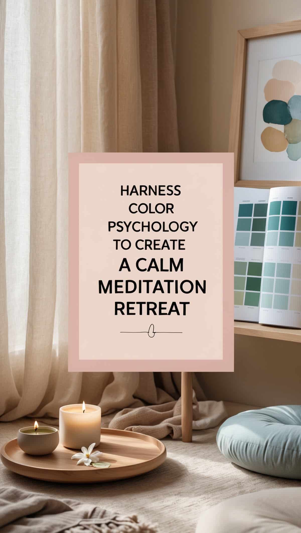
The science behind color psychology is both fascinating and practical—it reveals how different hues affect our mood and energy. Studies show that certain colors, like soft blues and greens, are linked to feelings of calmness and relaxation, while warm neutrals create comfort and balance. By choosing colors that support tranquility, you set the stage for a space that nurtures mental clarity and reduces stress. Research indicates that our brains respond to these colors by lowering heart rate and calming the nervous system, making your meditation space a true retreat for the mind.
I learned that color is much more than decoration—it’s a language that influences how we feel and behave. This knowledge helps you make informed choices about which hues to use, based on their psychological effects. For instance, soft blues can evoke the calm of a clear sky, while gentle greens remind you of nature and renewal. By understanding these concepts, you can tailor your meditation space to boost relaxation and create a sense of inner peace. This is not just theory; it’s a practical guide for using color to support mental and emotional well-being.
Benefits of Understanding Color Psychology
Understanding the science behind colors helps you select hues that naturally lower stress and boost tranquility. It provides a clear foundation for designing a space that supports your mental well-being.
Enhancing Your Mood with Color
Soft, natural tones like blue and green work to create a soothing environment by calming the mind and reducing anxiety. They establish an emotional baseline that prepares you for deep relaxation.
Pairing Color Psychology with Complementary Decor
Combining your chosen hues with simple, matching decor reinforces the calming effect. This harmonious approach ensures every element in your space contributes to a balanced, serene vibe.
ACTION STEPS: Understanding the Psychology Behind Color Choices
Steps to Achieve It
- Research basic principles of color psychology, focusing on how soft blues, greens, and neutrals affect mood.
- Obtain sample swatches of these colors and note their emotional impact.
- Test these swatches on a small section of your meditation space to see the effect firsthand.
- Choose decor items that mirror these calming hues and adjust your lighting to enhance the overall mood.
Picture This
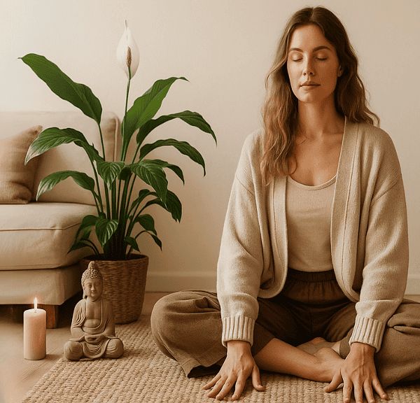
Imagine a cozy meditation space where soft blue walls gently merge with touches of green and warm neutral accents. Each color is carefully chosen to calm your mind and lower stress, creating a balanced, inviting area that feels like a breath of fresh air every time you step in.
Top 7 Color Schemes for a Calming Meditation Space
Designing your meditation space becomes easier with clear, specific color schemes. I’ve refined my experiments into seven proven options that work beautifully even in small areas. These schemes come with precise color details and practical tips to help you choose the perfect combination for your space. Each option is designed to create a calming atmosphere and boost your emotional well-being.
By using these seven color schemes, you can remove the guesswork from your design process. Each scheme is not only aesthetically pleasing but also backed by the principles of color psychology. With exact hex codes and actionable design advice, you’ll know exactly what to purchase and how to integrate it into your meditation space. This direct approach empowers you to create a balanced, stress-relieving environment without unnecessary complexity.
1. Soft Blue & Crisp White

Soft Blue & Crisp White evokes a serene, airy feeling reminiscent of a clear sky and fresh snow. Soft blue creates a calm and cooling atmosphere, while crisp white adds brightness and clarity. Together, these colors make the space feel open and refreshing.
This palette emphasizes simplicity and lightness. The gentle blue soothes the mind, and the pure white offers a perfect balance, promoting a tranquil setting ideal for meditation.
Benefits of Soft Blue & Crisp White
- Benefits: Creates a serene atmosphere that lowers stress and enhances clarity.
- Enhancing Calm Ambiance: Soft blue relaxes the mind, while crisp white brightens the space.
- Pairing with Complementary Accents: Use white trims and minimal decor to maintain balance.
ACTION STEPS: How to Create This Look
- Purchase soft blue paint (#A5B9C7) for walls.
- Use crisp white (#FFFFFF) for accents and trims.
- Choose minimalist decor that enhances brightness.
- Optimize natural lighting to highlight the serene tones.
Picture This
Picture a meditation space with soft blue walls paired with crisp white accents. The room feels open, light, and perfectly balanced, inviting you to relax and unwind in a clear, refreshing atmosphere.
2. Earthy Green & Warm Beige
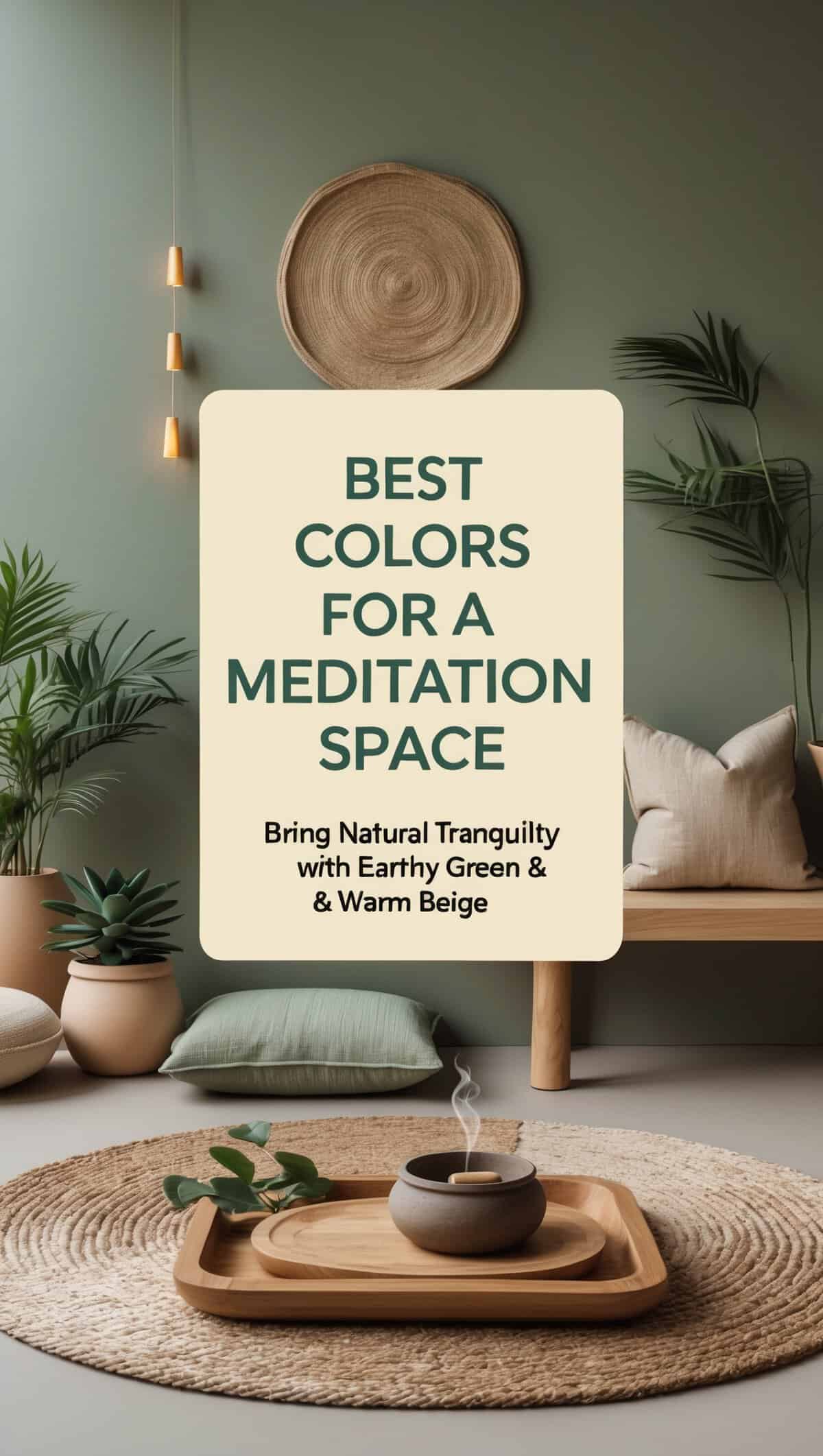
Earthy Green & Warm Beige conjures images of a quiet garden and soft natural light. Muted sage green exudes calm and renewal, while warm beige adds a comforting, grounded touch.
This combination creates a balanced, organic environment that naturally invites tranquility. The hues harmonize to evoke nature’s gentle beauty, making your meditation space feel inviting and serene.
Benefits of Earthy Green & Warm Beige
- Benefits: Provides a natural, soothing vibe that grounds the space.
- Enhancing Natural Harmony: The green evokes calm, and beige adds warmth.
- Pairing with Natural Accents: Works well with wooden or stone elements for a cohesive look.
ACTION STEPS: How to Create This Look
- Choose a muted sage green paint (#B2C7B9) for walls.
- Use warm beige (#F5F5DC) for accents and decor.
- Incorporate natural elements like wood and plants.
- Ensure ample natural light to enhance the organic feel.
Picture This
Picture your meditation space with walls in muted sage green accented by warm beige decor. The natural hues merge to create a tranquil and organic retreat, perfect for quiet reflection.
3. Warm Taupe & Soft Cream
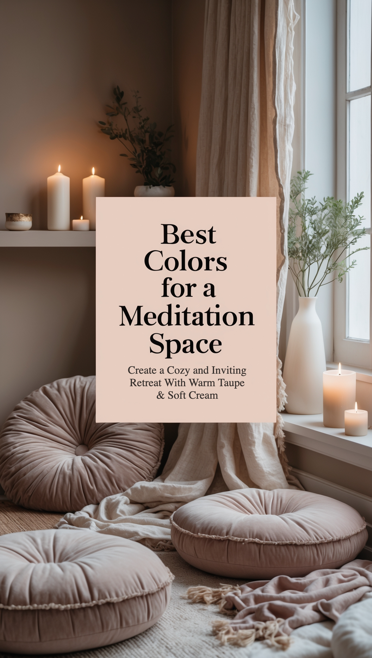
Warm Taupe & Soft Cream delivers a cozy and refined ambiance with a balance of depth and light. Warm taupe introduces an elegant, earthy tone, while soft cream brightens the space with a gentle, airy feel.
Together, these colors create a sophisticated yet inviting atmosphere that is ideal for quiet relaxation. The subtle contrast supports a serene environment that feels both comforting and stylish.
Benefits of Warm Taupe & Soft Cream
- Benefits: Establishes a cozy, intimate setting that calms the mind.
- Enhancing Warmth: Taupe adds depth, and cream lightens the mood.
- Pairing with Elegant Accents: Complements natural wood or metallic decor for a refined look.
ACTION STEPS: How to Create This Look
- Paint walls in warm taupe (#D2B48C).
- Use soft cream (#FFFDD0) for trims and decor.
- Add elegant accents like wood or simple metallics.
- Utilize ambient lighting to enhance the warm, inviting feel.
Picture This
Picture a meditation space enveloped in warm taupe, balanced by soft cream accents. The setting is cozy and refined, offering a perfect backdrop for peaceful reflection and quiet moments.
4. Pastel Lavender & Light Gray

Pastel Lavender & Light Gray presents a delicate and modern palette that inspires calm. Pastel lavender introduces a soft touch of color reminiscent of blooming florals, while light gray provides a cool, neutral balance.
This combination creates a soothing and stylish environment. The gentle contrast offers an understated yet creative vibe, ideal for a peaceful meditation space that feels fresh and inviting.
Benefits of Pastel Lavender & Light Gray
- Benefits: Calms the mind with soft, gentle hues.
- Enhancing Creative Calm: Lavender inspires subtle creativity, while gray grounds the look.
- Pairing with Minimalist Decor: Complements clean, modern elements for a harmonious finish.
ACTION STEPS: How to Create This Look
- Use pastel lavender (#cdc2df) on primary surfaces.
- Accent with light gray (#D3D3D3) in trims and decor.
- Choose minimalist decor to maintain a clean aesthetic.
- Enhance with soft, even lighting to accentuate the gentle hues.
Picture This
Picture a meditation space bathed in soft pastel lavender and accented by light gray. The room exudes a modern, artistic tranquility that invites quiet introspection and creative thought.
5. Soft Aqua & Sandy Beige
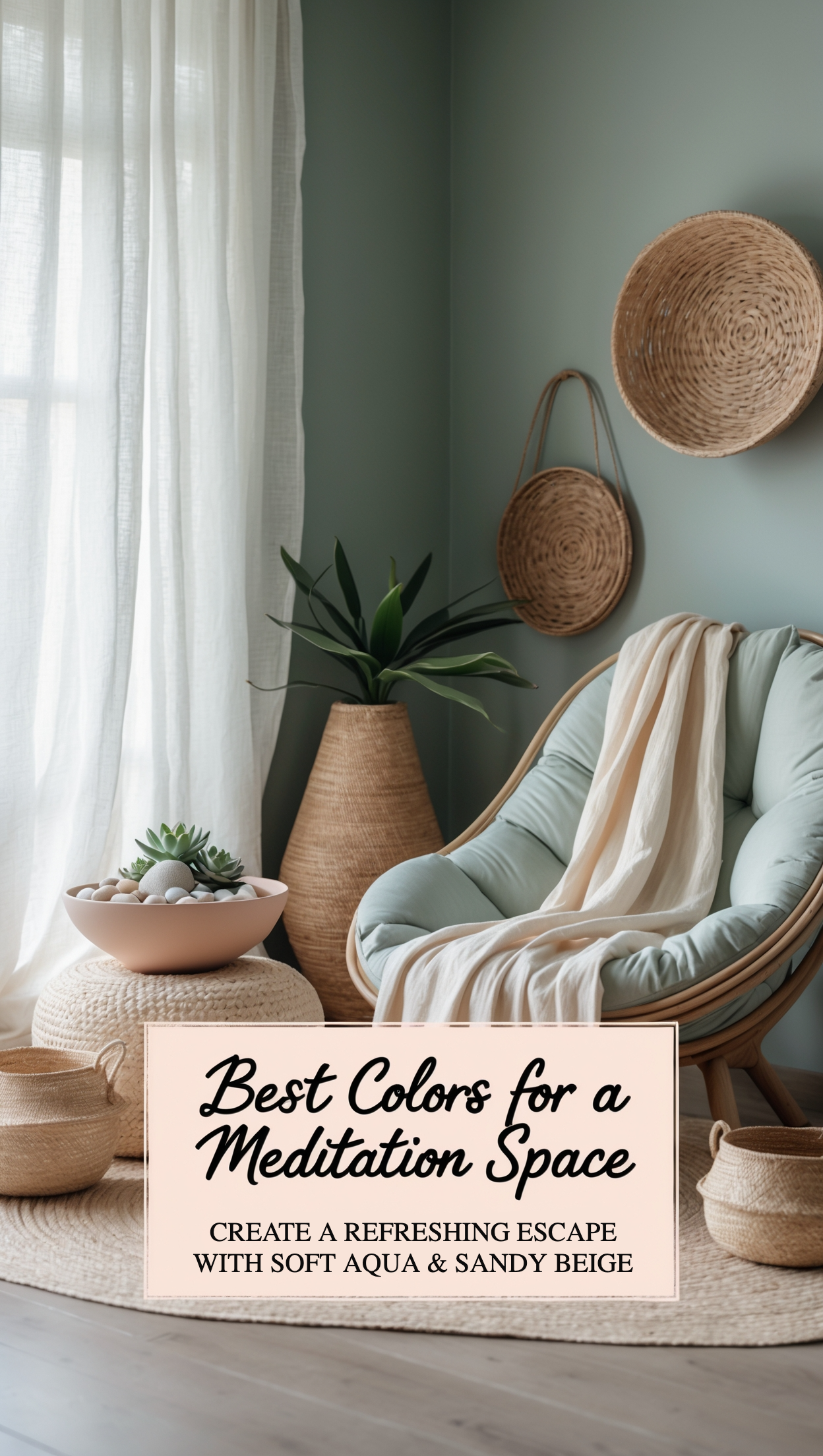
Soft Aqua & Sandy Beige brings the refreshing feel of a coastal breeze into your meditation space. Soft aqua offers a cool, calming effect reminiscent of clear ocean waters, while sandy beige adds a warm, natural touch.
This palette creates an airy and relaxed atmosphere that balances coolness with subtle warmth. It evokes the peaceful vibe of a seaside retreat, perfect for fostering a sense of renewal and calm.
Benefits of Soft Aqua & Sandy Beige
- Benefits: Evokes a refreshing, coastal vibe that reduces stress.
- Enhancing Freshness: Aqua cools the space, while beige adds inviting warmth.
- Pairing with Natural Textures: Works well with rattan or driftwood for an organic feel.
ACTION STEPS: How to Create This Look
- Paint walls in soft aqua (#B2DFEE).
- Use sandy beige (#F0E68C) for accents and furnishings.
- Integrate natural textures like light wood or wicker.
- Maximize natural light to amplify the coastal ambiance.
Picture This
Picture your meditation space with soothing soft aqua walls complemented by sandy beige accents. The look is fresh, airy, and reminiscent of a quiet beach, offering an inviting retreat for relaxation.
6. Light Coral & Ivory

Light Coral & Ivory infuses your meditation space with a soft, warm burst of color. Light coral introduces a gentle vibrancy reminiscent of a delicate sunrise, while ivory provides a neutral, calming foundation.
This combination creates an uplifting yet balanced atmosphere that brightens your space without overwhelming it. The harmonious interplay of coral and ivory brings a subtle energy and clarity to the environment.
Benefits of Light Coral & Ivory
- Benefits: Adds a gentle, warm energy to uplift the mood.
- Enhancing Light and Balance: Coral injects color; ivory maintains calm neutrality.
- Pairing with Simple Accents: Ideal for highlighting focal decor without clashing.
ACTION STEPS: How to Create This Look
- Use ivory (#FFFFF0) on main surfaces for a bright base.
- Incorporate light coral (#F08080) in accent pieces like cushions.
- Select modern, simple decor that highlights the color contrast.
- Enhance with soft lighting to maintain a balanced ambiance.
Picture This
Picture a meditation space where gentle light coral accents play beautifully against a pristine ivory backdrop. The warm yet neutral combination creates a peaceful and inviting retreat that soothes the senses.
7. Muted Mustard & Olive

Muted Mustard & Olive offers a rich, earthy palette that exudes warmth and natural charm. Muted mustard provides a subtle depth and character, while olive green adds a calming, organic balance.
This scheme creates a distinctive and grounded atmosphere. The blend of these bold yet soothing hues creates an inviting space that feels both vibrant and tranquil, perfect for meditation.
Benefits of Muted Mustard & Olive
- Benefits: Offers a unique, earthy vibe that enhances warmth.
- Enhancing Bold Calm: Mustard adds depth, while olive creates a stabilizing effect.
- Pairing with Organic Accents: Complements natural textures for a cohesive, grounded look.
ACTION STEPS: How to Create This Look
- Choose muted mustard (#D2B04C) for primary accent areas.
- Use olive green (#808000) for complementary decor.
- Incorporate organic materials like wood or woven textures.
- Adjust ambient lighting to emphasize the rich, earthy tones.
Picture This
Picture your meditation space adorned in rich muted mustard and soothing olive green. The earthy, balanced combination creates a uniquely vibrant yet tranquil retreat, inviting you to relax and reconnect with nature.
Incorporating Natural Elements and Lighting
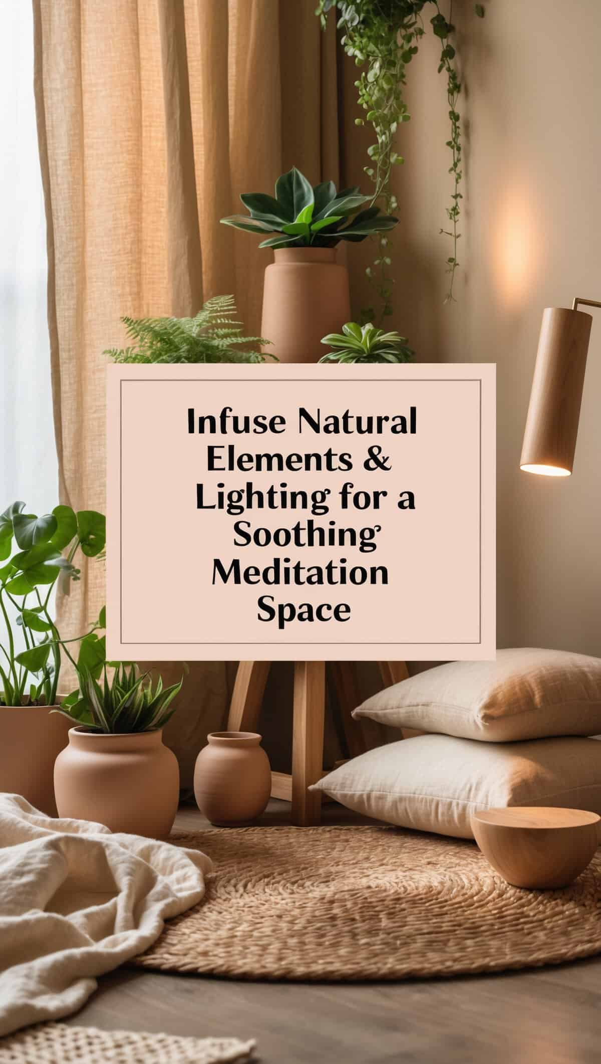
Infusing your meditation space with natural elements and thoughtfully planned lighting elevates the calming effects of your chosen colors. When I first introduced indoor plants and natural wooden accents into my space, I noticed a significant boost in its overall tranquility. Natural light, when allowed to gently filter through sheer curtains, adds a dynamic quality that highlights the soft hues on your walls. Together, these elements create a living, breathing space that is both soothing and energizing.
Integrating nature with your color scheme can transform your space into a mini oasis. It’s all about striking a balance between man-made design and organic beauty. A few well-placed plants or a small vase of fresh flowers can enhance the natural vibe and offer a refreshing contrast to the color palette. These simple touches not only improve the aesthetics but also help you feel more connected to the world outside, deepening your sense of calm and focus.
Benefits of Natural Elements
Natural decor items make your space feel more organic and warm, reducing the sterile feeling of typical interior design. They provide a direct connection to nature that helps lower stress.
Enhancing Ambiance with Lighting
Good lighting brings out the depth and texture of your chosen colors, creating inviting pools of light that draw you into the space. It can dramatically transform the mood by accentuating the softness of your hues.
Pairing Nature with Indoor Decor
When natural elements and your color scheme work together, they create a balanced, harmonious environment. This synergy results in a space that feels both thoughtfully designed and naturally inviting.
ACTION STEPS: Incorporating Natural Elements and Lighting
Steps to Achieve It
- Keep windows clear and use light, sheer curtains to maximize natural light.
- Add a few indoor plants or natural decor items such as wooden ornaments.
- Use adjustable lamps to create soft, ambient lighting that complements your colors.
- Experiment with the arrangement until the natural and color elements feel balanced.
Picture This
Picture your meditation space bathed in soft, natural light, where gentle beams highlight a blend of soothing hues and vibrant green plants. The natural decor and thoughtful lighting work in harmony to create a serene, inviting environment that perfectly complements your calming color scheme.
Practical Tips for Choosing and Combining Colors
Selecting and combining colors doesn’t have to be overwhelming if you break the process down into manageable steps. I learned that creating a mood board and testing small patches of color are essential practices that save time and prevent costly mistakes. These practical steps ensure that every hue you choose works harmoniously with the others and supports a balanced, calming atmosphere in your meditation space. It’s all about careful planning and methodical testing until you achieve the perfect blend.
Sometimes it takes a few adjustments and even a little frustration before you nail the ideal mix, but those small wins are what make your space truly yours. By following clear, practical tips, you ensure that every color works together seamlessly to create an environment that feels both unique and wonderfully peaceful. Focusing on the details—the ratio of colors, the contrast between tones, and how they interact with your decor—leads to a space that not only looks cohesive but also supports your need for calm.
Benefits of Practical Selection
Straightforward, practical tips streamline your decision-making process and help you choose colors that naturally blend well together. This method reduces guesswork and ensures your space feels balanced.
Enhancing Cohesion Through Combination
A well-thought-out color palette ties your space together, creating a consistent and inviting look that is easy on the eyes. This cohesive approach turns every element into part of a larger, harmonious design.
Pairing Colors with Accent Pieces
Using accent pieces that reflect your chosen colors adds depth and character to your meditation space. These small details reinforce the overall theme and make the area feel more complete.
ACTION STEPS: Choosing and Combining Colors
Steps to Create This Look
- Create a mood board featuring various color swatches and inspiration images.
- Test small patches of paint on your wall to evaluate the blend.
- Use fabric or decor samples to assess the overall harmony.
- Adjust the mixture until you achieve a balanced and soothing palette.
Picture This
Imagine a meditation space where every color is deliberately chosen and flawlessly combined, resulting in a harmonious setting that feels both vibrant and peaceful. Each hue works in concert with the others, creating an inviting area that immediately draws you into a state of calm.
Final Thoughts
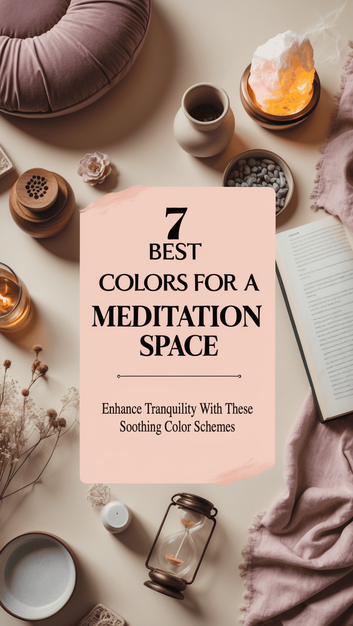
Transforming your meditation space with the right colors and decor is a journey of creativity and thoughtful planning. With these seven color schemes and practical tips I’ve shared, you now have a clear roadmap to design a space that supports both mental clarity and emotional well-being.
Whether you choose the calming effects of soft blues or gentle greens — creating a balanced and inviting retreat is well worth your time and attention. Even if you’re working with a small corner instead of a full room, these actionable ideas empower you to craft a space that feels personal and nurturing.
Embrace the process with patience and experimentation, knowing that each small change brings you closer to a haven of tranquility. Take these insights and start designing your meditation space into a supportive, peaceful retreat that reflects your style and meets your needs. Enjoy the process and let your space evolve into a true sanctuary for relaxation and creative expression.
This post may contain some affiliate links. I only recommend products and services I genuinely believe in. Additionally, some content on this website may have been created with the assistance of AI.
Frequently Asked Questions
What colors work best for a meditation space?
Soft blues, light greens, warm neutrals, and pastels are excellent choices because they lower stress and create a calming atmosphere. These colors work together to set a peaceful tone that supports mindfulness and relaxation. Experiment with different shades to find the combination that best suits your space.
How do I choose the right color scheme for my small meditation space?
Start by determining the mood you want to create and use the seven specific schemes as a guide. Testing small patches of color and creating a mood board can help you visualize the final look. This method ensures that your chosen scheme harmonizes well in your limited area.
Can I update my meditation space without major renovations?
Absolutely. Small, regular updates like swapping decor items or rearranging your space can significantly refresh the area. These subtle changes help maintain a calming vibe without the need for a complete overhaul.
How do DIY projects enhance my meditation space?
DIY projects add a personal touch and unique character to your space, making it truly your own. They allow you to express your creativity while keeping the decor budget-friendly. Handmade items also create a stronger connection between you and your space than mass-produced products.
About The Author
Jahlila Violette Bastian is a Transformational Whole-Self and Wellness Lifestyle Empowerment Coach and the creator of The Tri-Sync Method. She helps women who feel stuck in the exhausting cycle of dieting, self-sacrifice, and uninspired routines reclaim their energy, confidence, and well-being—without guilt or overwhelm. You know what it feels like to keep pushing—taking care of everything and everyone—while your own needs sit on the back burner.
Maybe you’ve tried every diet, every routine, every wellness trend, but nothing sticks. You want to feel good in your body, connected to yourself, feel at peace in your home, and in control of your life—but instead, you’re exhausted, frustrated, and craving more. Ready to take the first step? Explore more at The Tri-Sync Method.Com
Don’t wait another day to start living your healthiest, happiest life. Schedule a Free Discovery Consultation with Jahlila today to explore how The Tri-Sync Method can transform your life. For additional questions or personalized guidance, please visit our Contact Page.

Leave a Reply